Shinsen Ichiba
A complete brand identity and website for Shinsen Ichiba, a fresh-produce supplier - bringing everyday market freshness into a modern, systematic brand.
The challenge
Shinsen Ichiba has supplied fresh ingredients to restaurants, hotels, and retail businesses across Thailand since 2010. The company had outgrown its original identity - it needed a brand that feels as fresh as its produce, while carrying the credibility of a supplier that moves more than 3,000 ingredients every day.
The approach
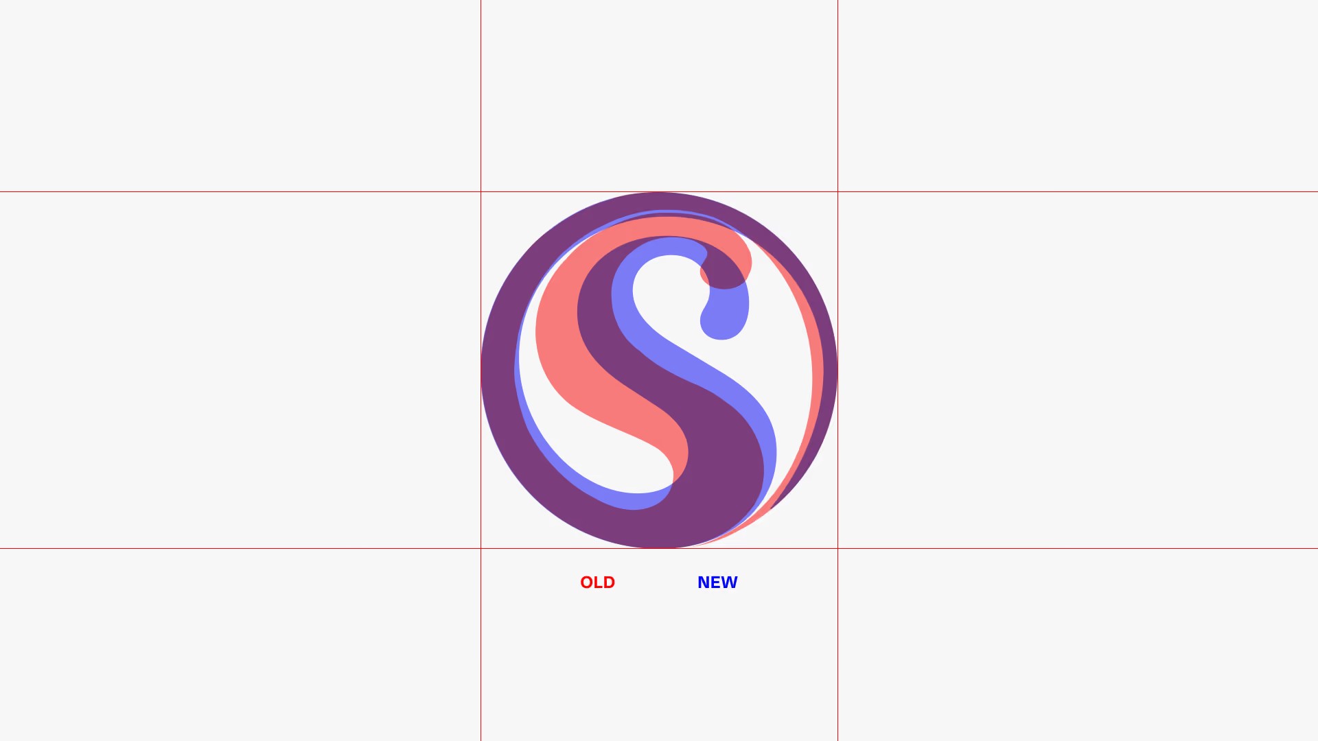
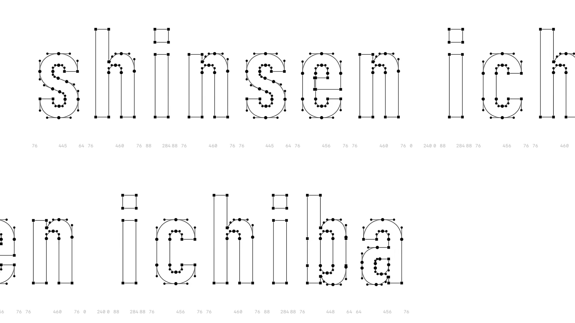
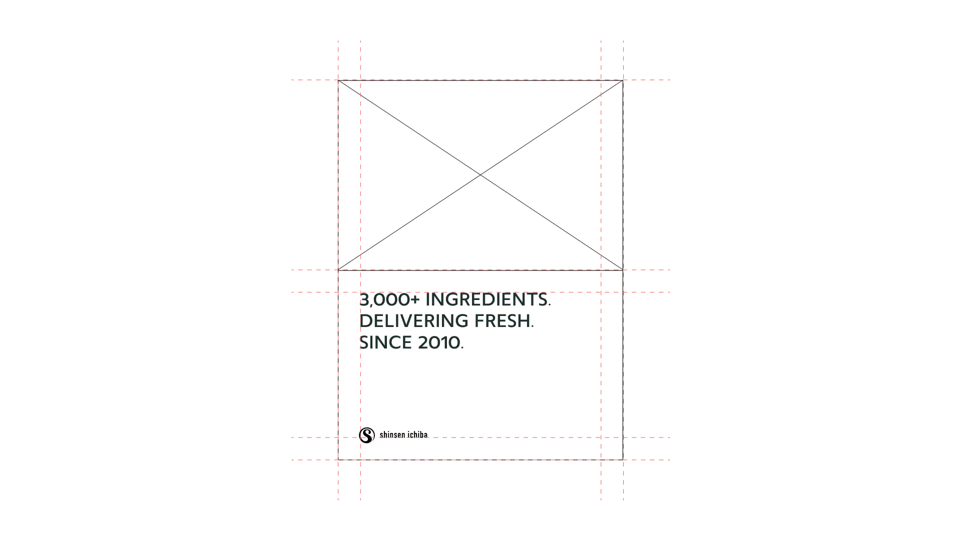
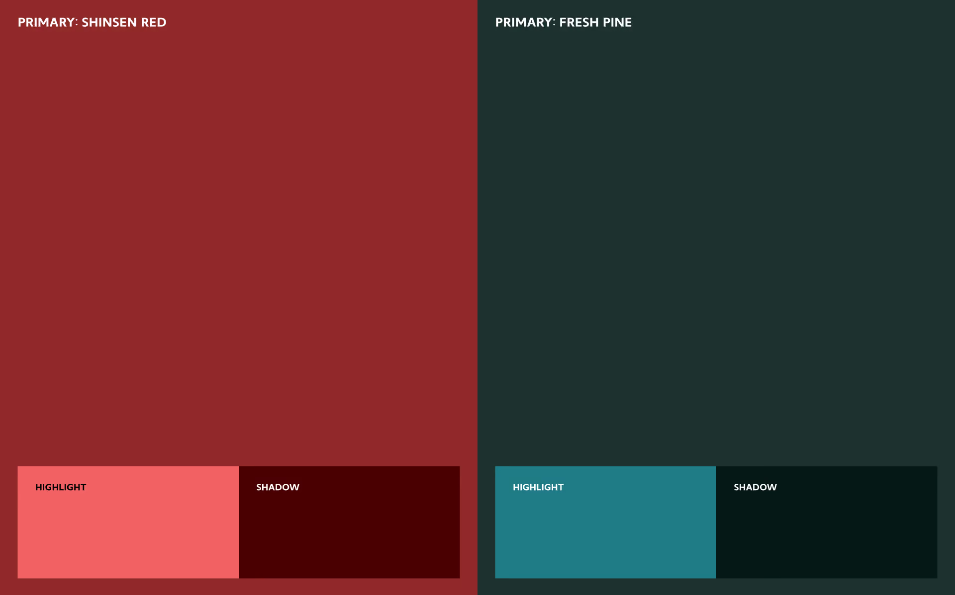
The identity begins with a refined S monogram, simplified from the original mark into a single confident form. A custom lowercase wordmark, a colour system built on Shinsen Red and Fresh Pine, and close-up photography of just-misted produce bring the sensation of the market into every application. A strict layout grid keeps posters, signage, and communication consistent from a business card to a street lightbox.
The outcome
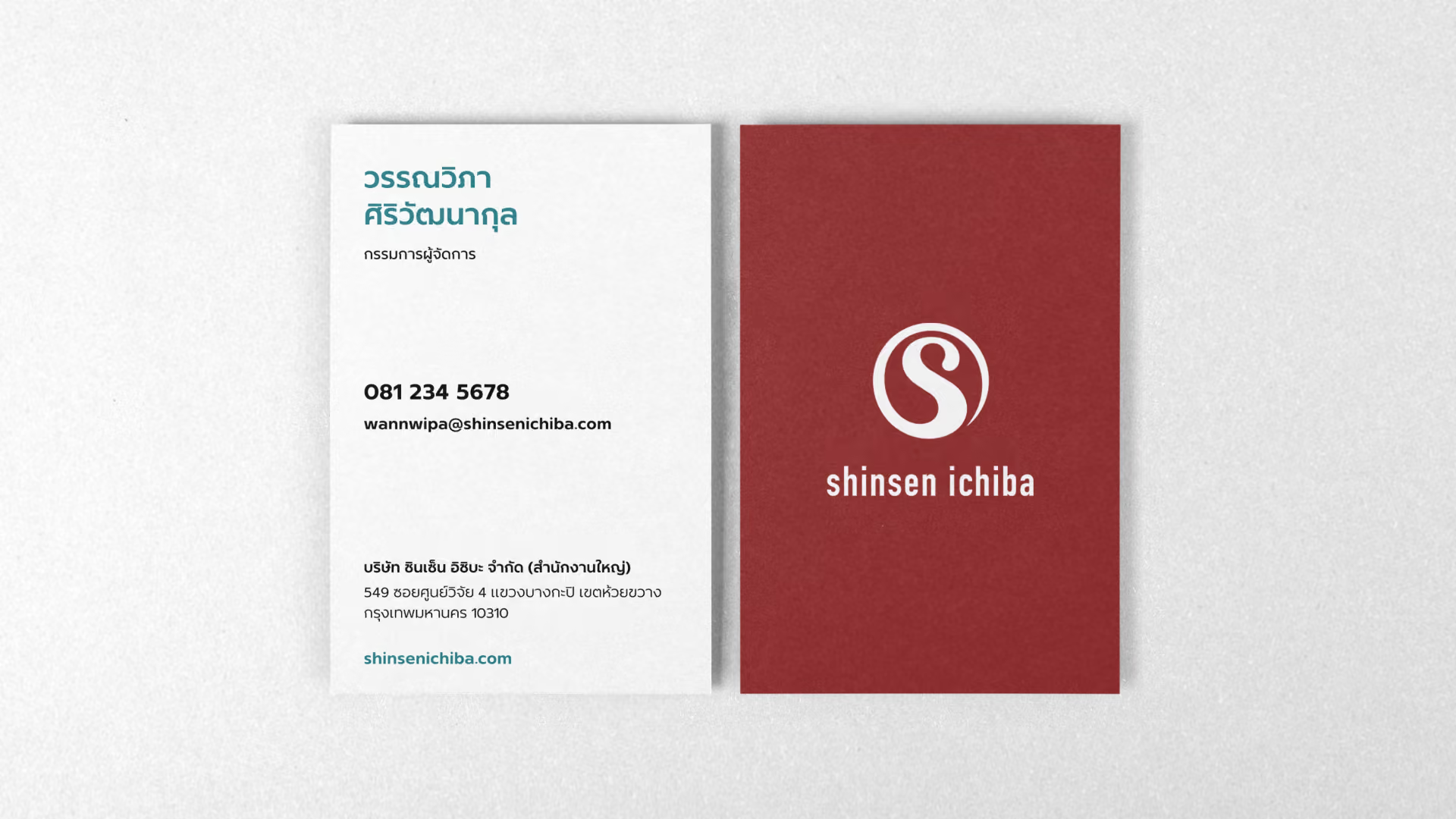
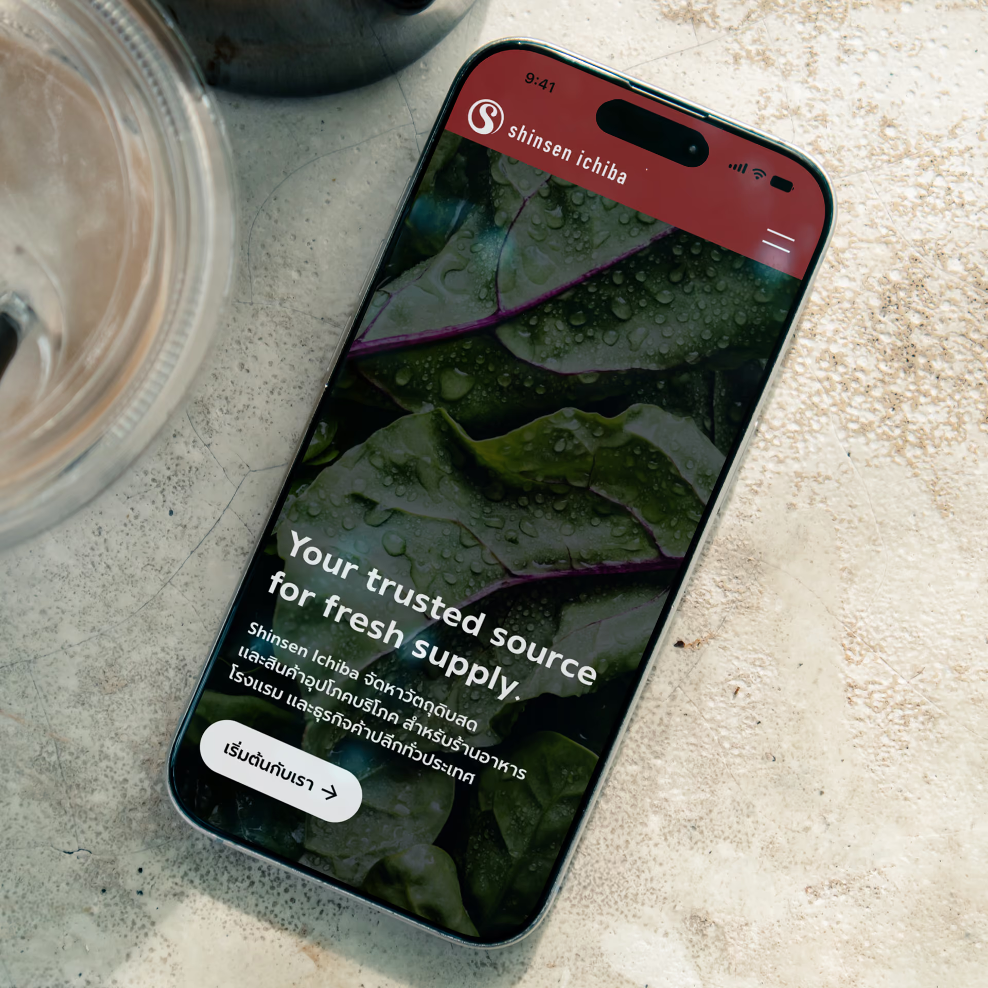
The new system carries Shinsen Ichiba from the wet market to the digital shelf - one voice across stationery, street signage, campaign posters, and a new website that tells the brand story and presents the catalogue to business customers. Fresh to look at, systematic to run.
Related expertise
Brand identity design
Website design and development
Project overview
Shinsen Ichiba is a fresh-produce supplier serving restaurants, hotels, and retail businesses across Thailand. Craftsmanship Co. redesigned the brand from the mark up - identity system, custom wordmark, colour and photography language - and carried it through to a new website, giving the company a presence as fresh and dependable as what it delivers.